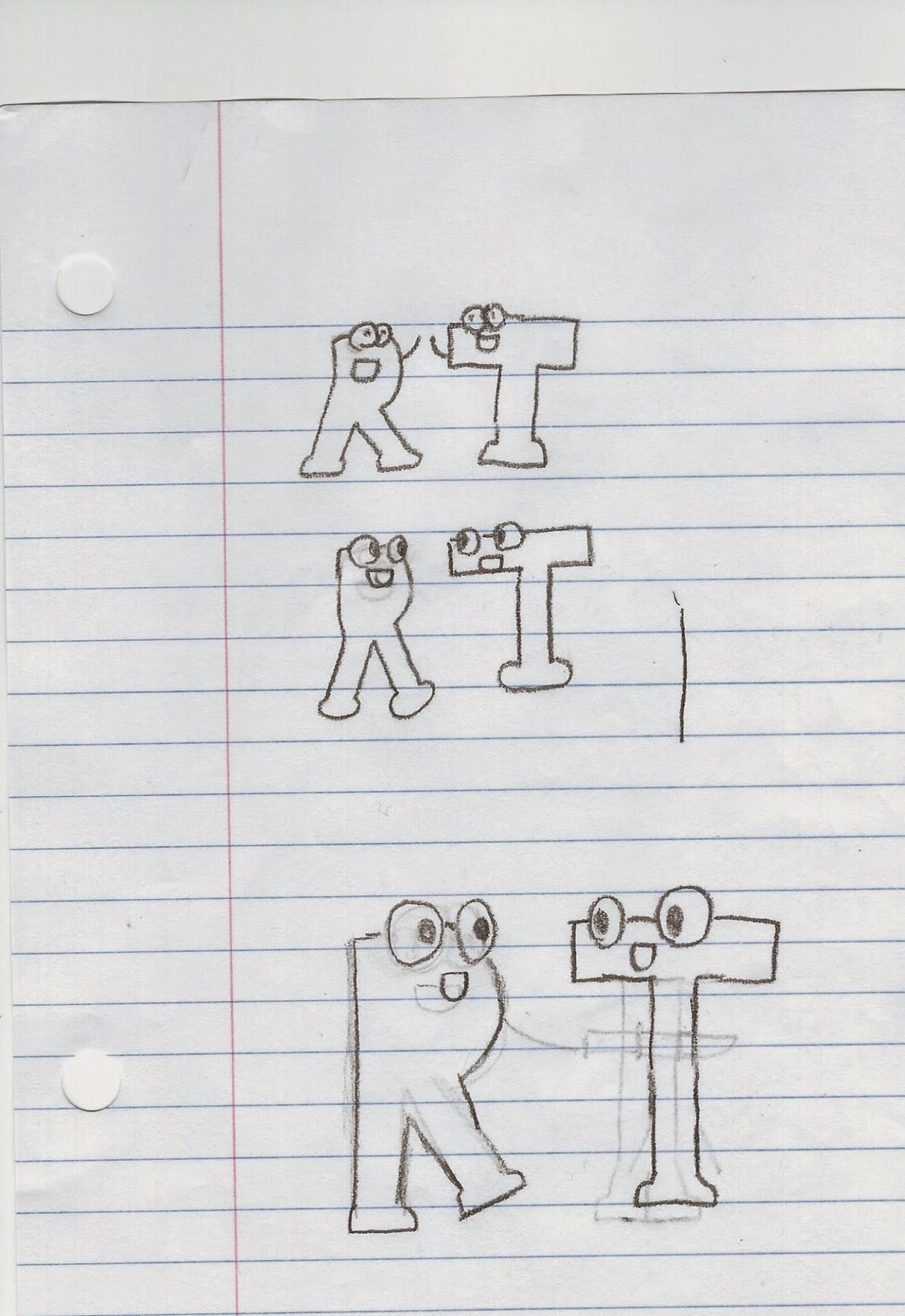
The sketch that I'm going to use is the bottom one.
After several other attempts, I felt that this set of designs best suited my target audience. I like how my logo is unlike any that came before it. It works in black and white, and I will probably color it some form of red, to go with the name. I like the bottom logo's balance better then the others. It's shapes feel even and I like the way they go together.
